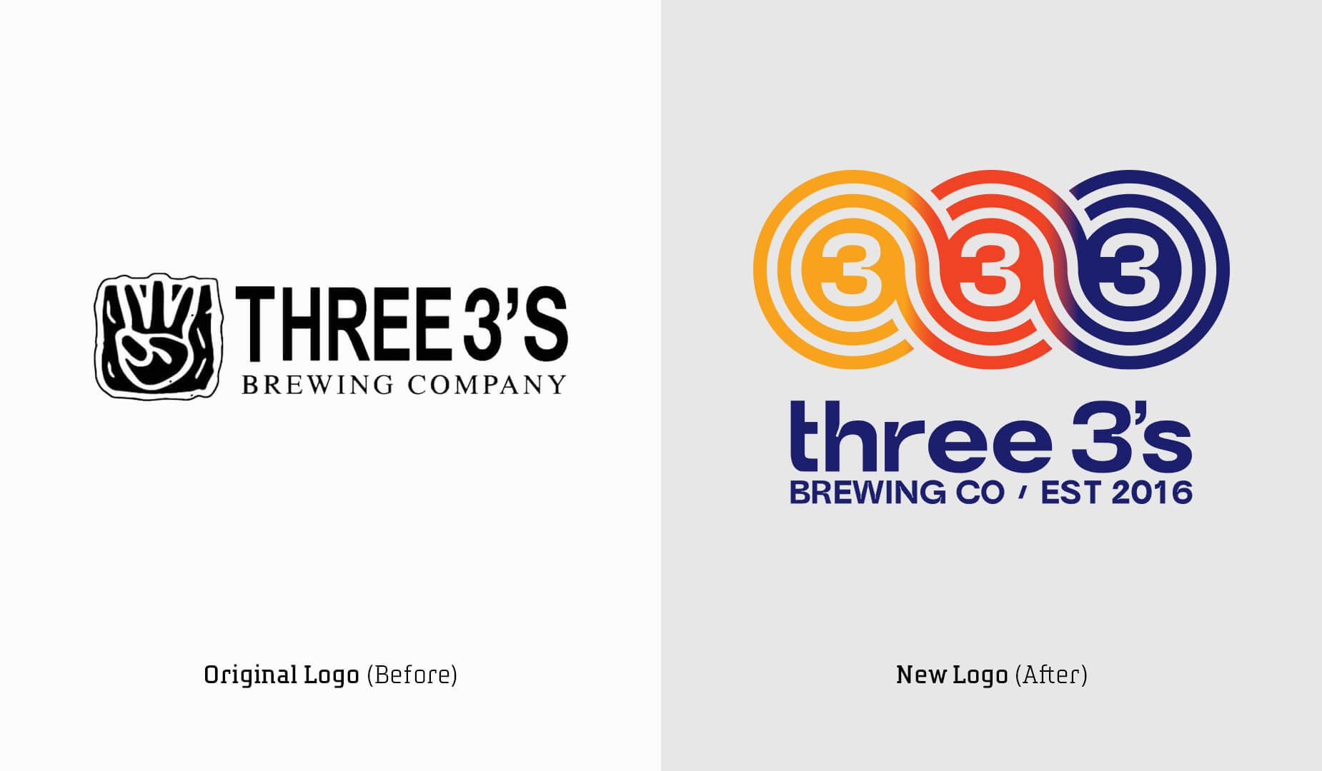
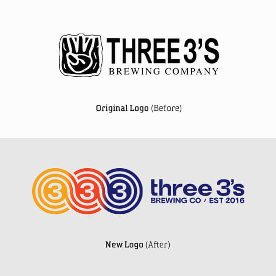
We gathered valuable insights during our discovery process — which consisted of stakeholder interviews with the owners, staff, distributors, retailers and customers plus a competitive audit of local, regional and national craft beers. These insights guided our development of a positioning statement, brand archetypes, brand story and target audience profiles, all of which contributed to a detailed creative brief that served as the blueprint for the rebrand.
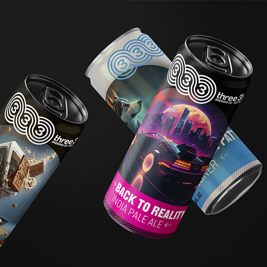
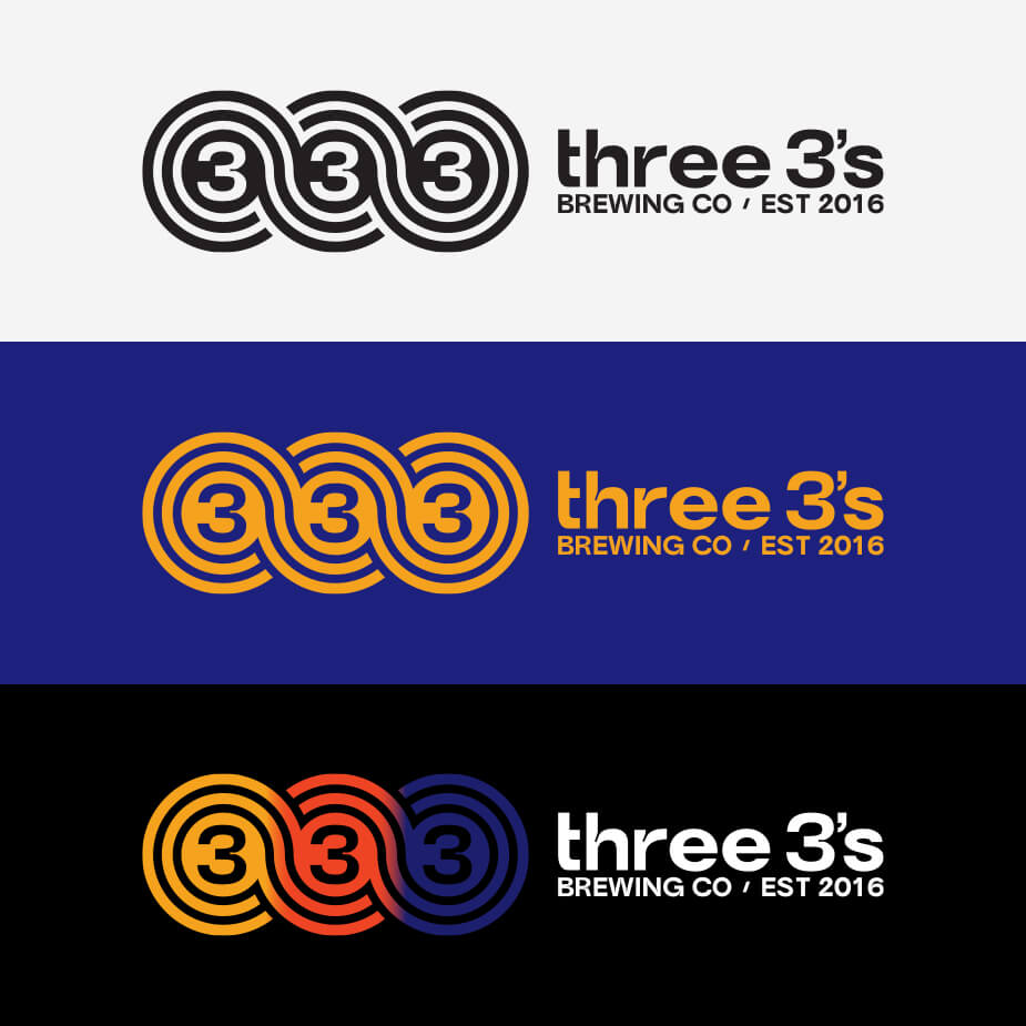
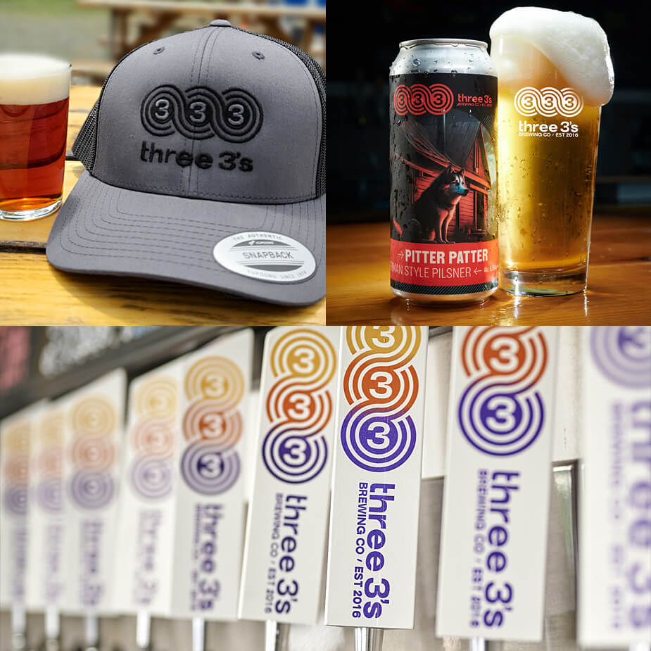
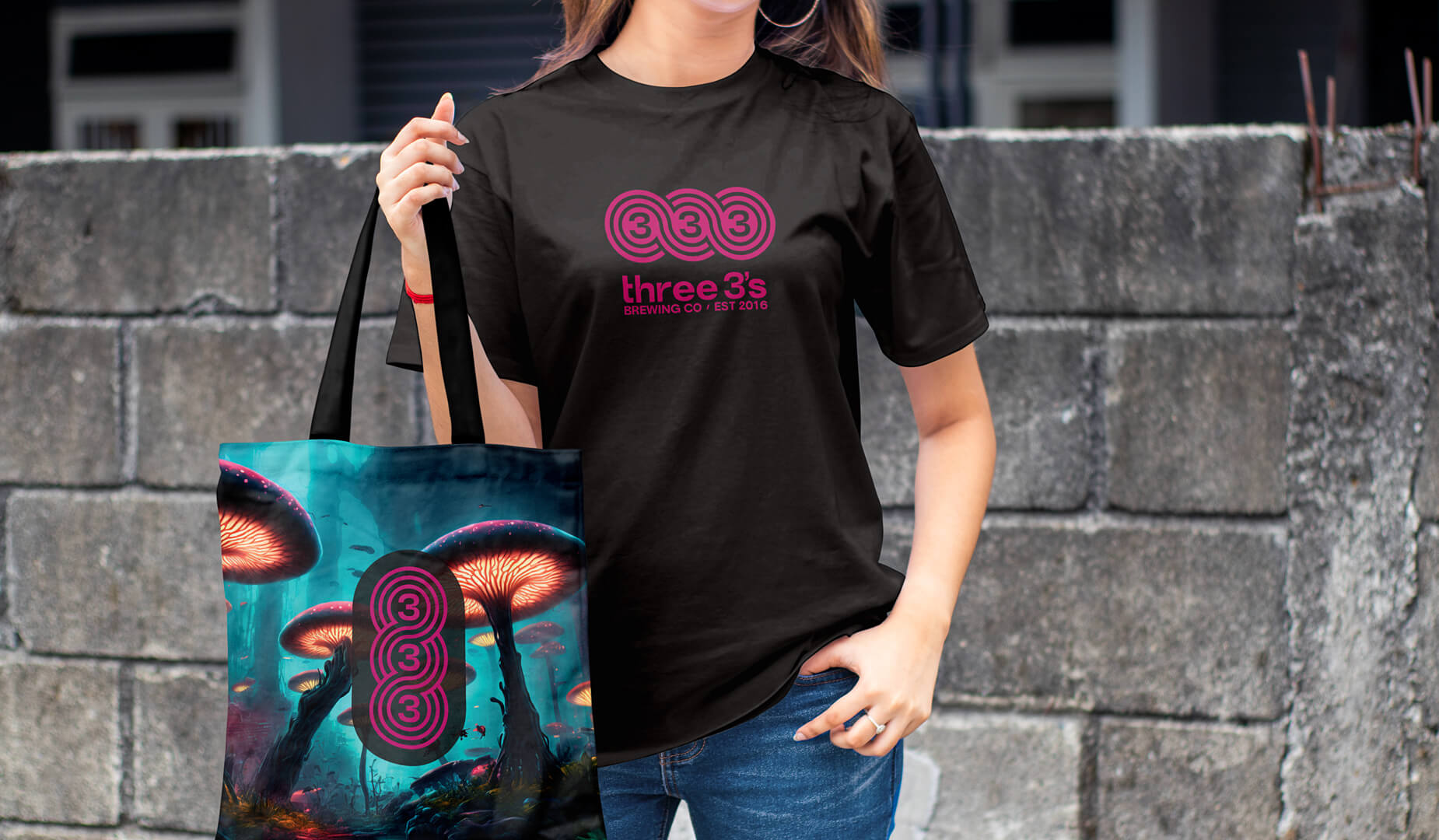
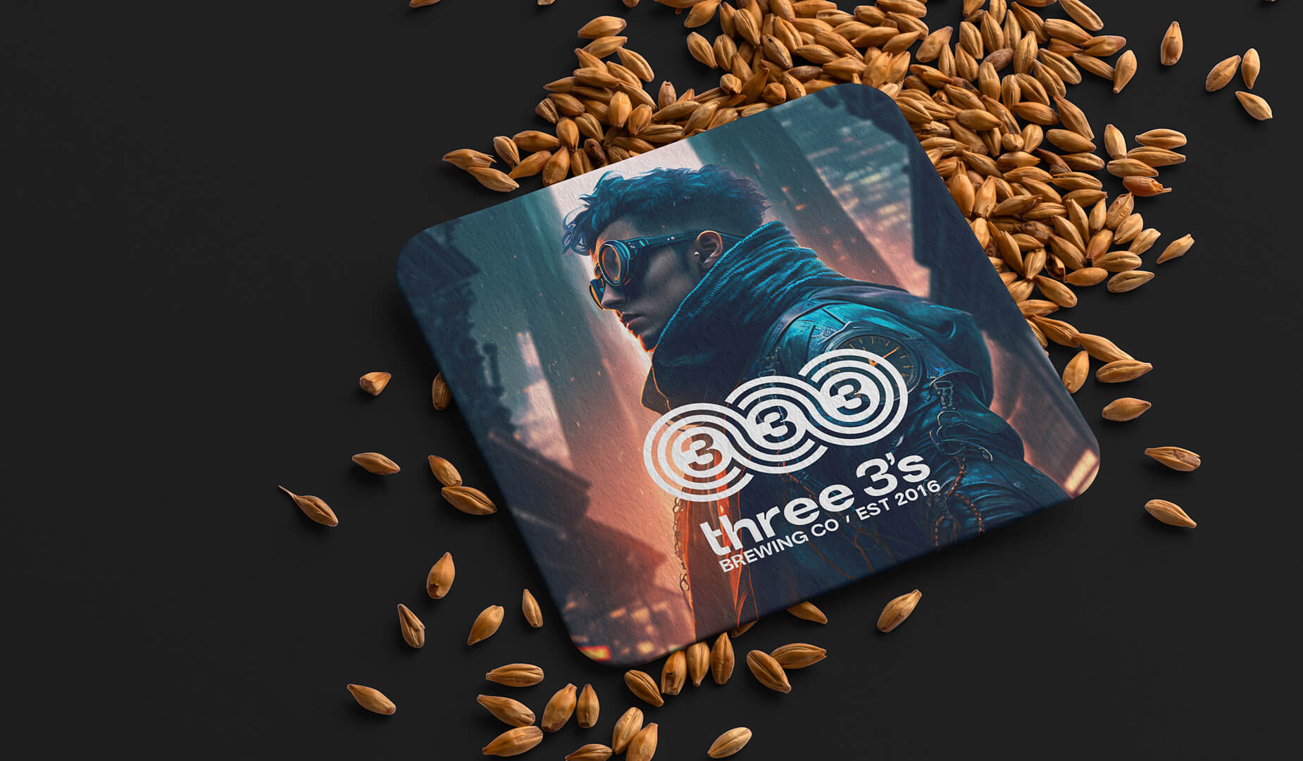
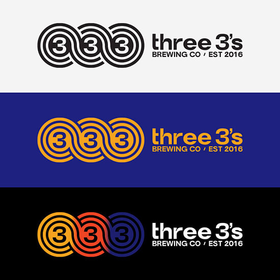
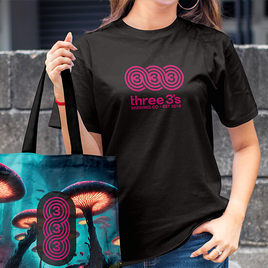
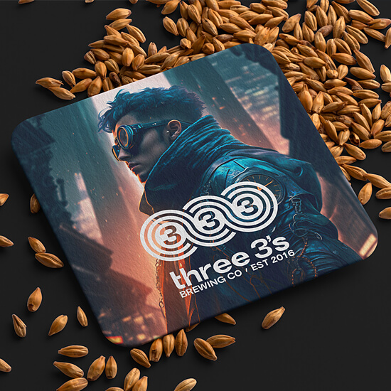
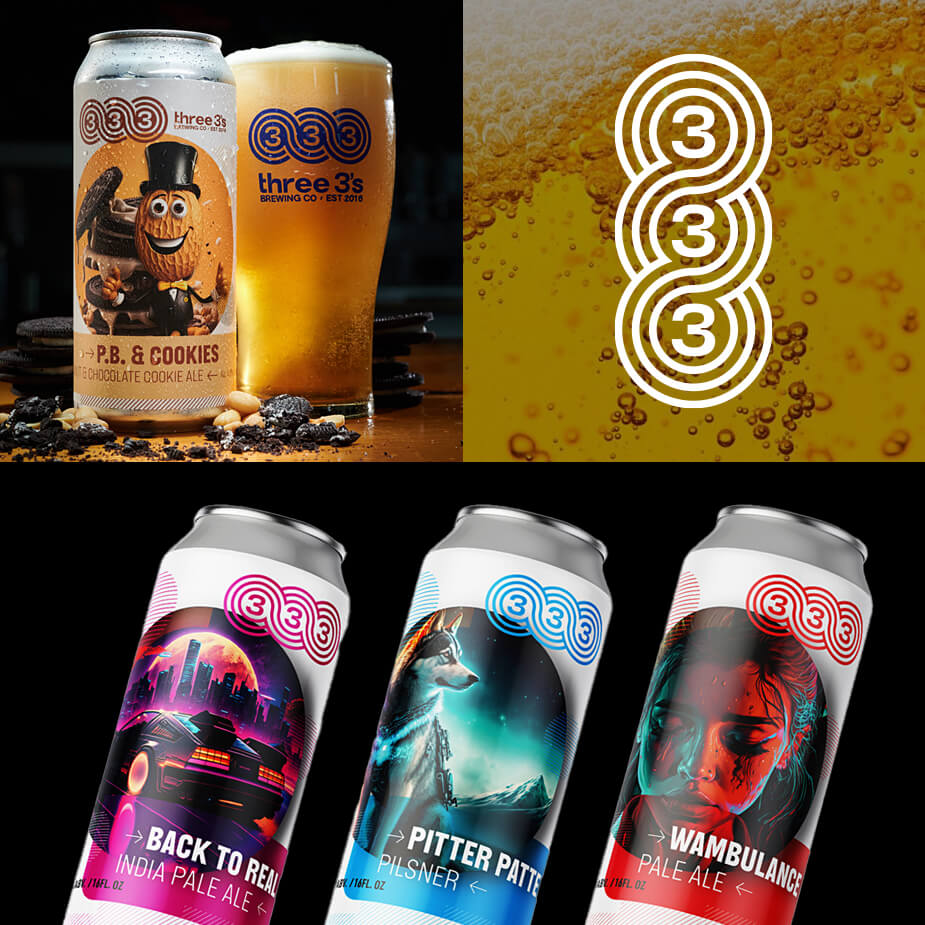
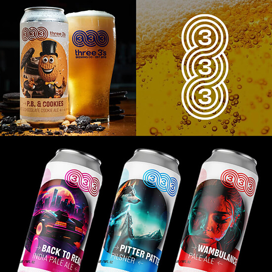
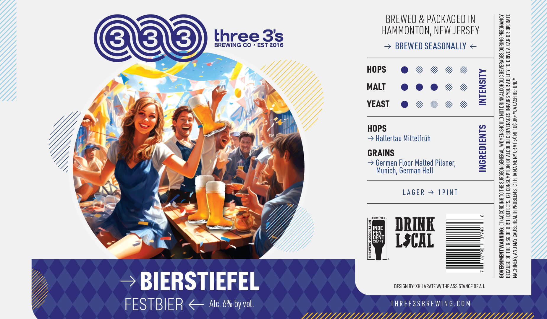
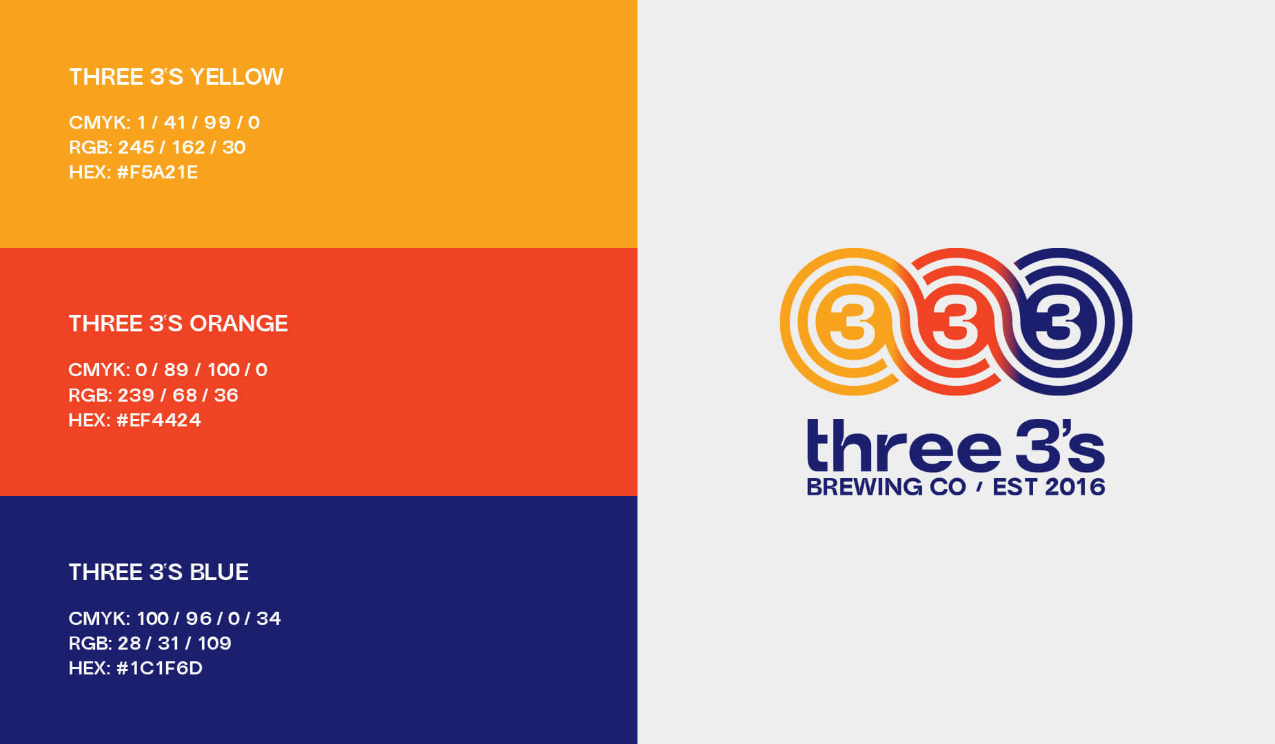
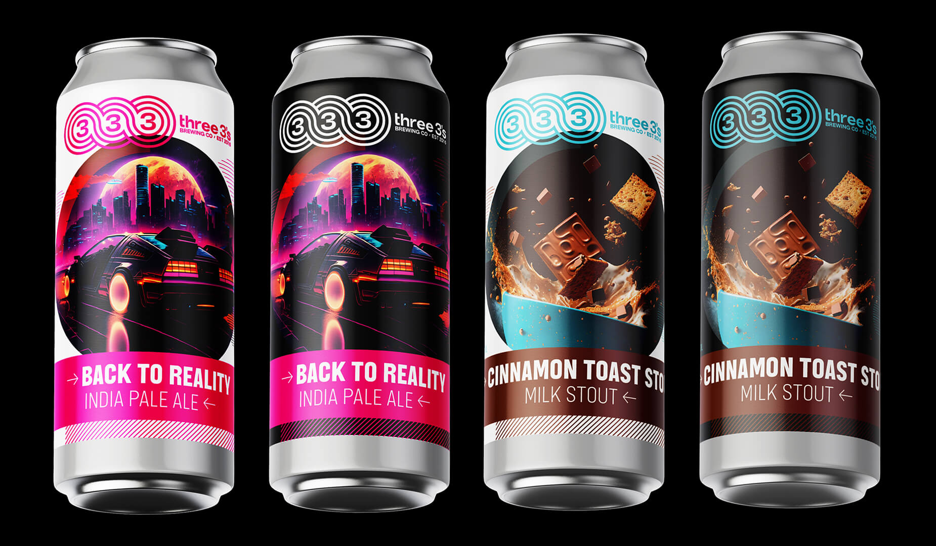
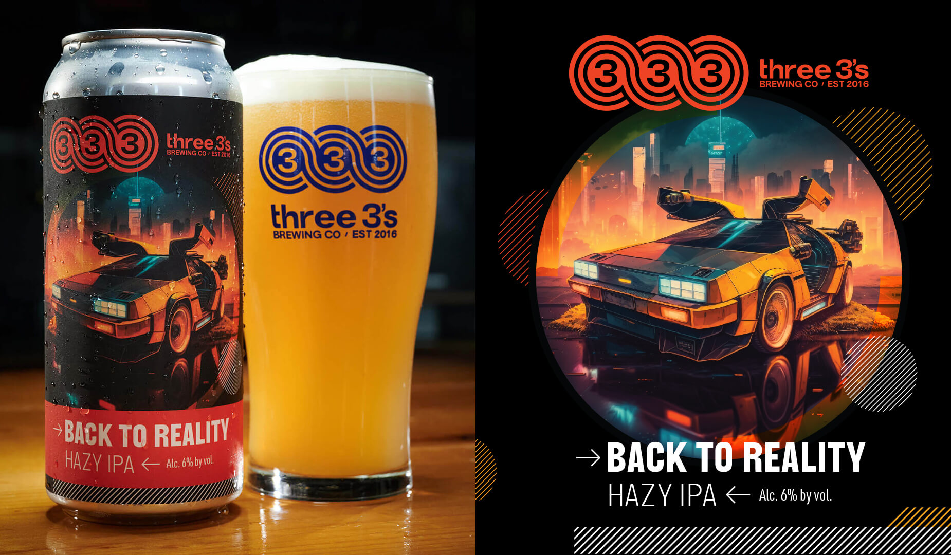
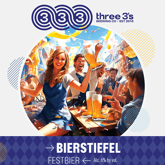
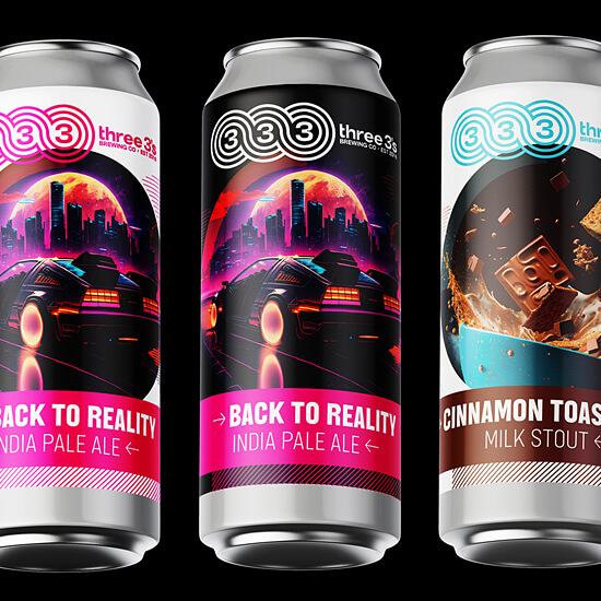
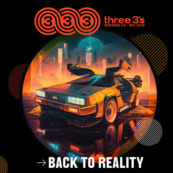
Based on our findings, the decision was made to retire the original logo (hand with three fingers), and the Xhilarate design team went to work on one that would communicate a fun, bold, and family-centered identity, one its customers could relate to in a more relevant way, one that differentiated it from other craft beers. The new logo features three number 3’s surrounded by an interlocking wave graphic with the Three 3’s name underneath. On the cans, the logo is positioned next to the Three 3’s name, providing a banner that boldly stretches across packaging and all other materials. The logo works in harmony with the design system, offering flexibility across merchandise, displays, and packaging.