The rise and fall of neumorphism
How and why did neumorphism’s subtle blend of light, shadows, and curves come in and out of fashion so quickly?
Neumorphism first hit the design world in 2020.
At first, designers loved the modern and clean aesthetic that neumorphism (also known as neomorphism) offered. They embraced the glossy minimalism and simple embedded UI elements. Neumorphic elements felt like they’d been shaped out of polished material, mimicking tactile shapes and real world textures with a subtle blend of light, shadows, and curves.
But the soft edges and airy designs characteristic of neumorphism seemed to fall out of favor as quickly as they fell into it.
To understand this rapid change, let’s step back and discuss where neumorphism came from and what made this design trend gain and lose appeal so quickly.
Neomorphism; an evolution of two design styles
Neumorphism is essentially a hybrid of skeuomorphism and flat design, rendered through a modern design lens.
Skeumorphic beginnings
Neumorphism isn’t the first design style to emulate 3D and material textures. We can trace neumorphism back to skeuomorphism, which also attempted to mimic the physical world.
Skeuomorphic design rose to prominence in the mid 90s. The idea was to make navigating the digital world and internet feel familiar through its use of 3D and objects from everyday life.
Elements like the trash bin or the folder icon made it clear what purpose they served. e. Additionally, websites had different types of clunky 3D user interface (UI) elements that mimicked actual buttons and sliders and used harsh drop shadows. It was common to see wood grain, plastic, shiny metal, and other organic-looking textures. Today, skeuomorphism looks clumsy and antiquated, but at the time, the design world embraced these as leading techniques in product and UI design.
The rise of flat design
Flat design was a response to the overly elaborate web designs of skeuomorphism. While skeuomorphism took a complicated approach to replicating the real world, flat design attempted to simplify things. This design style started showing up in the early 2000s, popularized in large part by Microsoft.
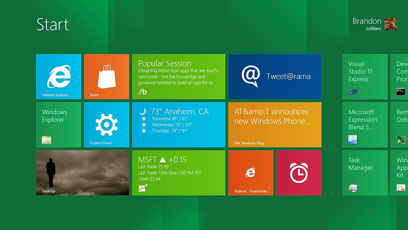
Flat design is based on minimalism — if something doesn’t help a visitor interact with a website, it’s left out. It strips websites and designs down to only what’s necessary. Instead of realism, flat design takes a two-dimensional approach. Typography is easy to read and color palettes are bright. This design concept places an emphasis on organization, with everything coming together to provide absolute clarity.
Skeumorphism + Flat Design = Neumorphism
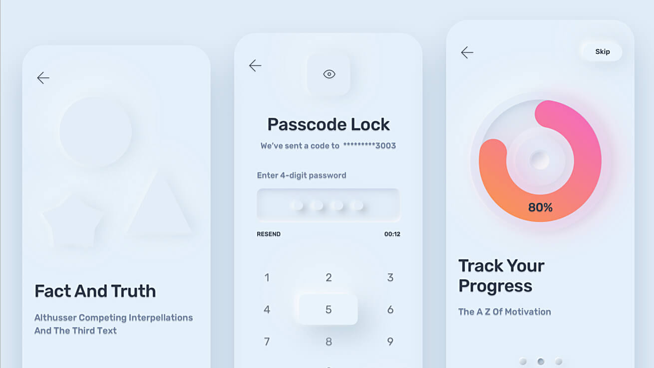
Neumorphic UI draws from both skeuomorphic and flat design concepts, offering a sense of physicality in a more refined way. While we still see some mimicking of real world elements (such as neumorphic buttons), neumorphism embraces the minimalistic look of flat design, which prioritizes ease of usability over ornamentation.
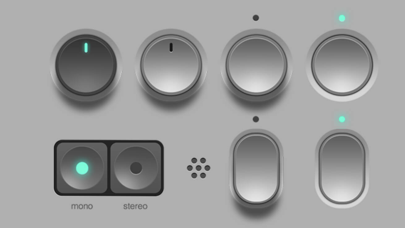
With a gentle touch, neumorphism bends light and shadows to create a sense of dimensionality. Rounded corners and thin lines are favored over blunt geometry. Generous amounts of gray or white space give every element plenty of breathing room resulting in open and inviting layouts.
Neumorphism sculpts pixels through blur, light, shadows, and geometry. It’s a minimal aesthetic with simple color palettes, but it also has depth and dimensionality. By embracing neutrality, it delivers an unencumbered user experience.
The rapid ascent of neumorphism
Most track the birth of neumorphism to 2020 when designer Alexander Plyuto posted this concept design for a mobile banking app. With this design, Alexander introduced a more nuanced and contemporary approach that moved away from the heavy-handed physicality of skeuomorphism.
Neumorphism is often referred to as “soft UI” and we can see this in Alexander’s design. Visuals seem to lift off from the screen with a featherlike lightness. UI elements are embedded into a faint background. The drop shadows are light and feel natural. Harmony is favored over sharp contrasts.
Alexander’s introduction of skeuomorphism made a huge impact and caught on quickly with designers excited to use this fresh aesthetic. Most prominently, was Apple’s 2020 launch of macOS Big Sur which featured skeuomorphic app icons that were touched with subtle drop shadows, depth, light patterns, and smooth curves. Apple’s adoption of neumorphism brought this design philosophy to a huge audience. The neumorphic style fit right into Apple’s ethos of “Think Different” and was a strong differentiator to Microsoft’s flat design. It was an aesthetic that felt like the future, instead of the stale design traditions of the past.
When something gets a lot of attention very quickly, it’s bound to receive scrutiny. There were grumblings about neumorphism before Apple used it, but this roll out of Big Sur brought on a flood of criticism. A major gripe was that there wasn’t any proof that it increased usability. Designers saw it as superfluous decoration that had no other point than being contrarian to standard design.
If neumorphism had remained small, it probably wouldn’t have fallen out of favor so quickly. The hype around neumorphism made its faults come to light in a flash, with designers all asking the same questions about usability. By 2021, most designers had eschewed it for design styles that already had a proven track record.

About Xhilarate
Xhilarate is a design and branding agency in Philadelphia that creates visual brand experiences that engage people, excite the senses and inspire our inner awesome. We are the arsenal of innovation. Xhilarate is a design consultancy dedicated to creating innovative brand and interactive experiences with an unyielding passion to create the extraordinary.
For More Information
Russ Napolitano / East Coast
russ@xhilarate.com
215 983 9990