Reinventing The Carousel
The research and design behind the evolution of the Material 3 carousel
For many users, there’s nothing like relaxing after a long day by scrolling through some of their favorite content. Maybe they’re feeling nostalgic, looking through photos of an old vacation they fondly remember. Scrolling horizontally back and forth, they can piece together the shape of those earlier days, recalling the exact moments the images captured.
Or picture this scene: a user wields their remote to scroll through movies or shows to watch. They’re probably not going to watch most of the content they scroll by, but they value seeing the broad selection all at once, and the available choices can help them decide on what they want to watch for the next two hours.
What do those two scenarios have in common? The ubiquitous carousel, of course.
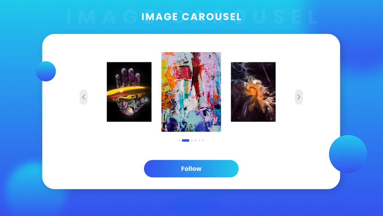
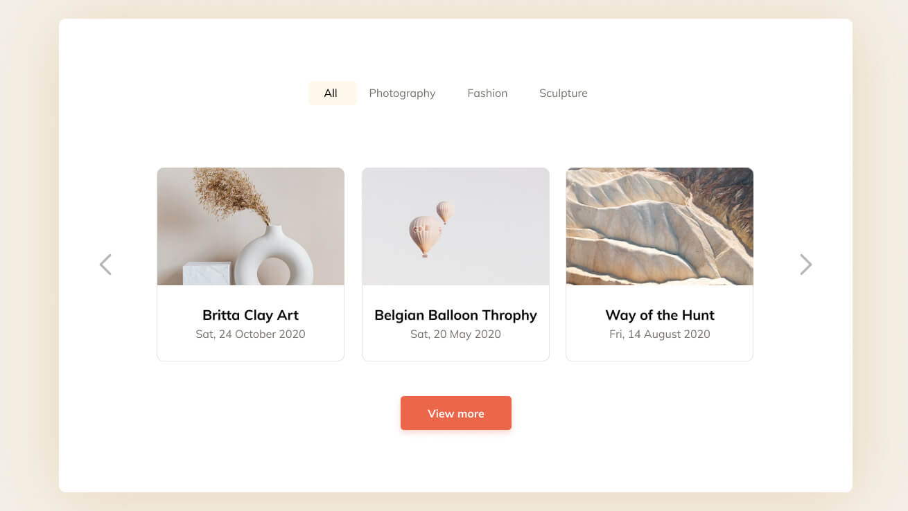
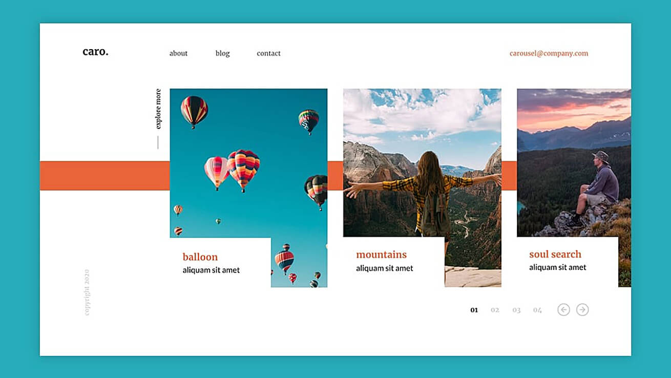
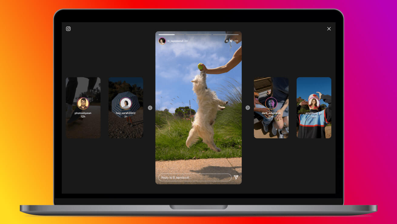
No, not that type of carousel! What we’re referring to is the carousel component – a pattern that you’ve probably seen many times across desktop or mobile devices. Consider this ubiquitous carousel:
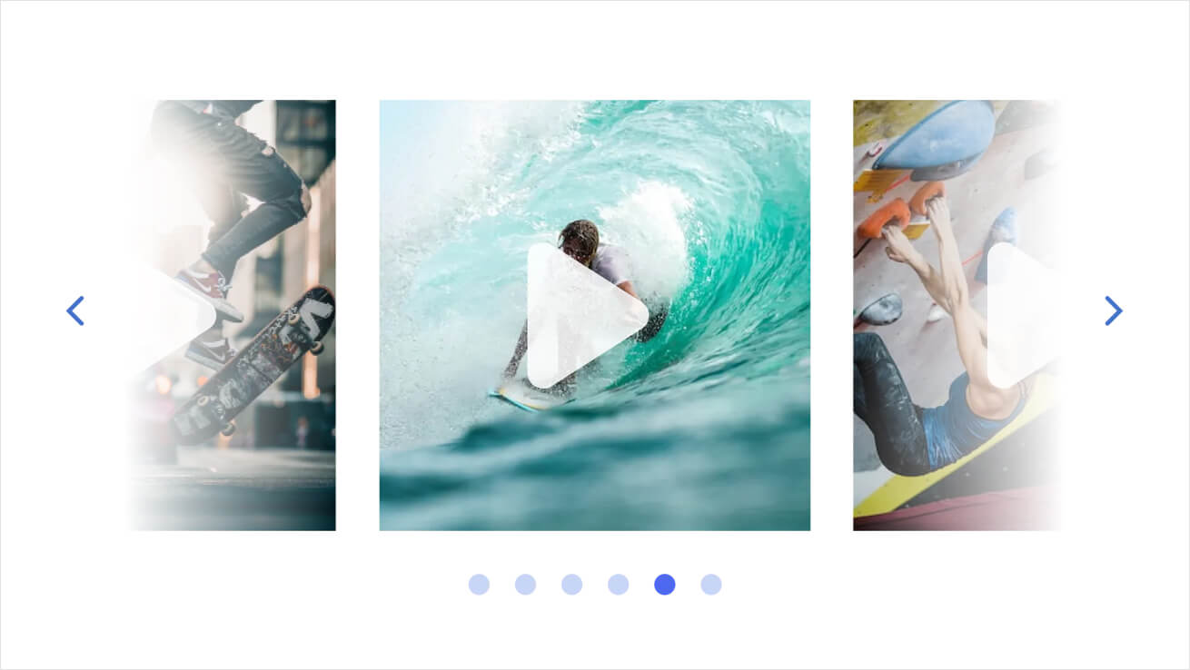
A carousel component is a rotating array of content that allows users to scroll horizontally to view a list of items that aren’t immediately visible on the screen–for example, recipes, videos, and news.
For such a simple sounding interaction, there are a lot of details that need to be attended to for this component to work well for everyone, in all the products that may adopt it. For instance, how many items should a carousel component have? Is three too few? Is 15 too many? Or what about 50, or 100? And how does the amount of content influence the perception of scrolling through that content? Should pace be a function of length, or should the type of content or the product context (for example., a media player versus a news app) be a stronger determining factor for the feeling of scrolling through the list?
Imagine a user browsing an online store for the latest novel in a mystery series, scrolling available books in a carousel. What’s the right level of detail to present in that carousel to enable them to decide whether to buy the book, but not too much detail that might make the interaction feel crowded or unpleasant? Or what about a user scrolling through a carousel of short videos – what’s the right level of detail that allows them to confidently decide, “I’m gonna watch this,” without being overwhelming? And for both cases, how can a carousel support browsing, finding, and consuming, separately and together, sensitive to the content that a user is scrolling through?
How did we approach the design?
- To tackle this challenge, the Material Design team audited and identified the myriad ways in which carousels are currently implemented, the types of products they’re implemented in, and the types of interactions and product journeys they support.
- From this baseline, we set out to build something that could support existing use cases while also embracing a more usable, accessible, and expressive design. Our designers incorporated aspects of Material Design’s shape system, embracing a visual style that makes the carousel component more consistent and cohesive with other aspects of Material Design’d products. We also sought to incorporate aspects from the Material motion system, aiming to ensure that interacting with the component just feels right, responsive and alive.
- Beyond the visual style, our designers also reimagined the interaction pattern for a modern carousel. We varied the peek size—the size of the last visible element on a carousel—to more effectively communicate to users, “There’s more content here!” We modified the container shape of items within the carousel, allowing us to maximize the number of items shown, while also providing a visual hierarchy to help the user focus on the most important things. And although the smallest items don’t show the full picture, the cropped carousel container can still highlight the most salient part of the carousel item.
Throughout all these explorations, our primary goal was to ensure that the carousel was easy to use, easy to understand, and—if we can be so bold— delightful, expressive, and fun to use!
To make sure we could meet these goals, we relied on research.
Research
Our next step was to test with our users. We conducted two research studies, one quantitative and the other qualitative, to investigate the usability and desirability of the many carousel designs.
Phase 1: Quantitative study of five design variants
First, we conducted a quantitative study that investigated five variants of the carousel component. 202 participants answered questions as to whether they agreed with certain design characteristics, and to indicate their expectations for the number of items in each variant. We also showed them the carousel designs outside the context of a normal product and asked them: Where would you expect to find this? What type of content would you expect to see in this carousel?
We used data from these studies to determine how usable each variant of the carousel was. We also analyzed how users perceived specific design characteristics in terms of how they might approach using each variant, and the types of products where they would expect to find each variant. Ultimately, we identified the characteristics that lead to a more usable, delightful carousel experience that can be flexible given the needs of any product experience!
Moreover, we found that the different designs functioned similarly in quite a few ways. Participants across a range of ages knew how to use all new variants of this carousel. More specifically, they intuitively knew how to use horizontal or vertical scrolling to view hidden items, and they could anticipate what would happen if they clicked or tapped an item. They perceived their interactions with all the new carousel variants as largely positive, with participants ranking each variant on scales to identify how appealing or enjoyable each interaction was.
We noticed differences in perceptions of the new carousels in two specific ways. Regarding the number of items expected, our participants showed more uncertainty both in the vertical variant of the carousel or a variant that presented only a single image as very large (in other words, a hero image version). In all of the other “single advance” (moving one at a time) or “multi advance” (moving multiple at a time) horizontal variants that we tested, participants showed certainty as to how many items they expected.
Another difference we noticed was that certain carousel variants were better for certain contexts. For example, while one variant was frequently described as helping “to better tell me what’s coming up next,” others were described as being ideal for very specific interaction patterns: “good for when looking for a photo album,” and “for browsing news articles.”
Phase 2: Qualitative study of two design variants
To gain a deeper understanding of how users felt about these new designs, we also ran a qualitative study where participants could talk through their initial thoughts and expectations of items and interactions. For this study, we focused on two carousel designs that performed best in the earlier quantitative analysis.
Through this second study, we realized that aesthetic preference didn’t impact which carousel fit a context. Knowing how to use the carousel also didn’t impact which carousel fit a context because both carousel types were intuitively understood by the participants, who felt that both variants appropriately signaled to them what was coming up next in the carousels.
Our participants let us know that there were two factors that were important for determining which variant of carousel they wanted to use for each context. The first factor depended on whether they needed to do a deep browse versus grabbing a quick item—for instance, reading through a carousel of news headlines versus swiping through a set of images of possible recipes to cook for dinner. The second factor depended on the weight of the commitment they were making by interacting with the carousel content—for example, selecting a movie from a carousel that might involve watching that content for two hours.
If it was a very big decision, participants explained that they wouldn’t want to swipe through too much content at once, or to do so too quickly. They explained that the multi-swipe option with previews was particularly helpful for tasks like grabbing an item and making a quick, non-critical decision, compared to browsing old photos or choosing what two hour movie to watch. More broadly, the current level of commitment and the predicted future level of commitment both had an impact on the designs of carousels that participants considered most desirable, and the contexts where participants felt those carousels could be most effectively used in.
Conclusion
Without further ado, we’re proud to introduce the new and very first Material design carousel! The design details of this component lean into the most expressive parts of Material 3, including drawing from the rounded corners of the Material shape system, and the smooth, responsive flow from the Material motion system. It uses adaptive shape morphing and dynamic scrolling to create a parallax effect to give users a unique and fresh experience for a familiar pattern.
The multi-browse carousel is now available in the Material Android Views library, and we plan to follow up with more variants in both Compose and Views. If you’d like to see it in action, keep your eyes open for its first implementation in Google Photos, or feel free to try it out yourself to build more dynamic, expressive products!

About Xhilarate
Xhilarate is a design and branding agency in Philadelphia that creates visual brand experiences that engage people, excite the senses and inspire our inner awesome. We are the arsenal of innovation. Xhilarate is a design consultancy dedicated to creating innovative brand and interactive experiences with an unyielding passion to create the extraordinary.