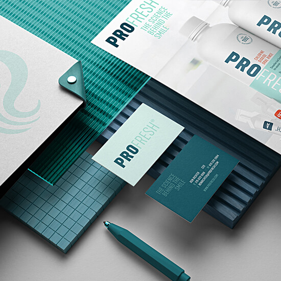
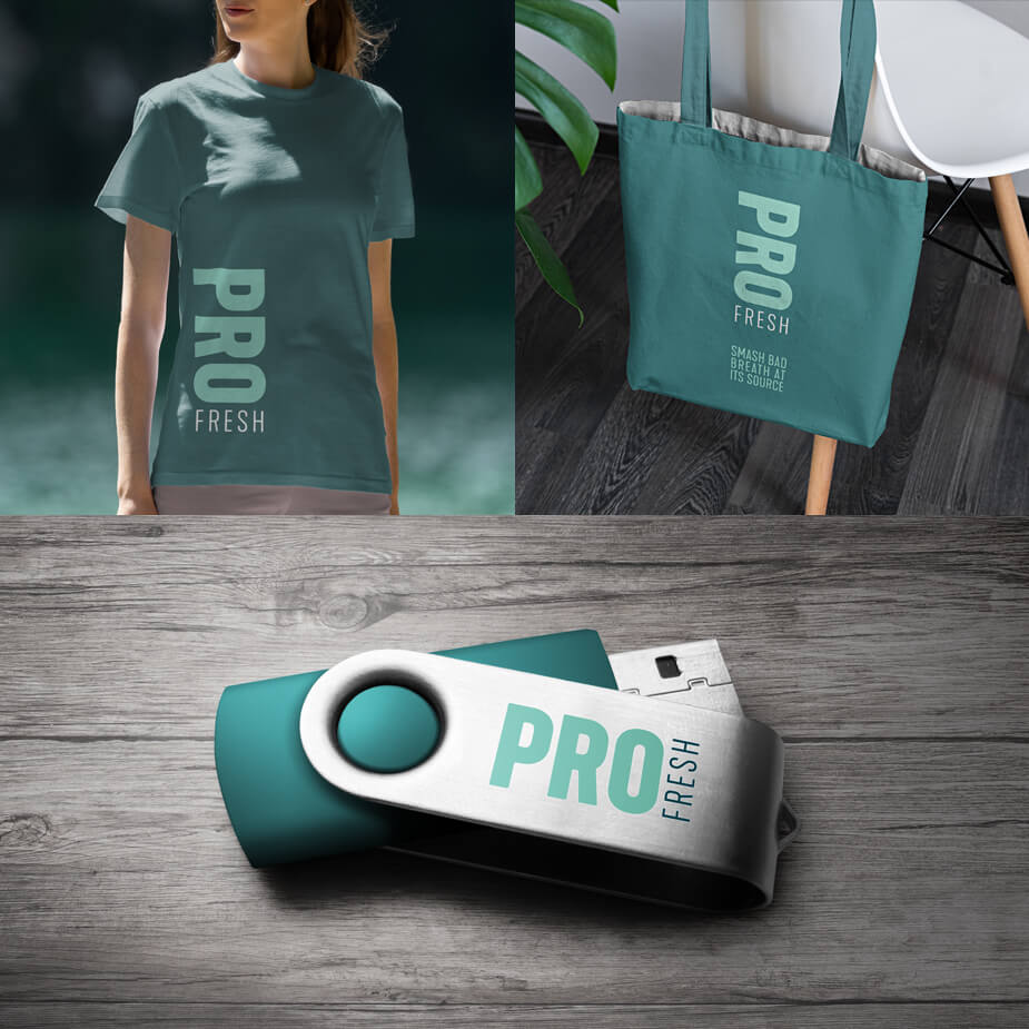
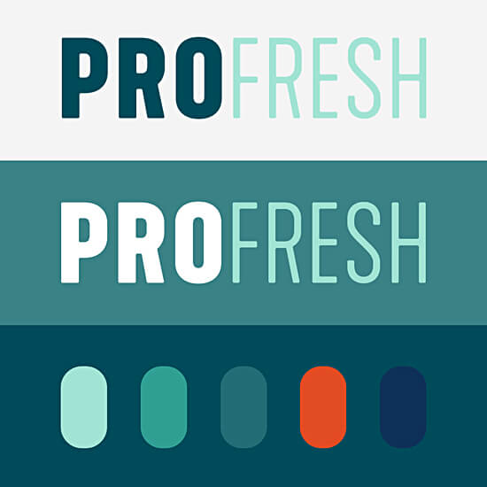
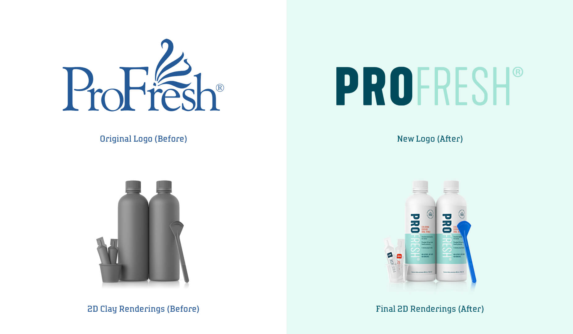
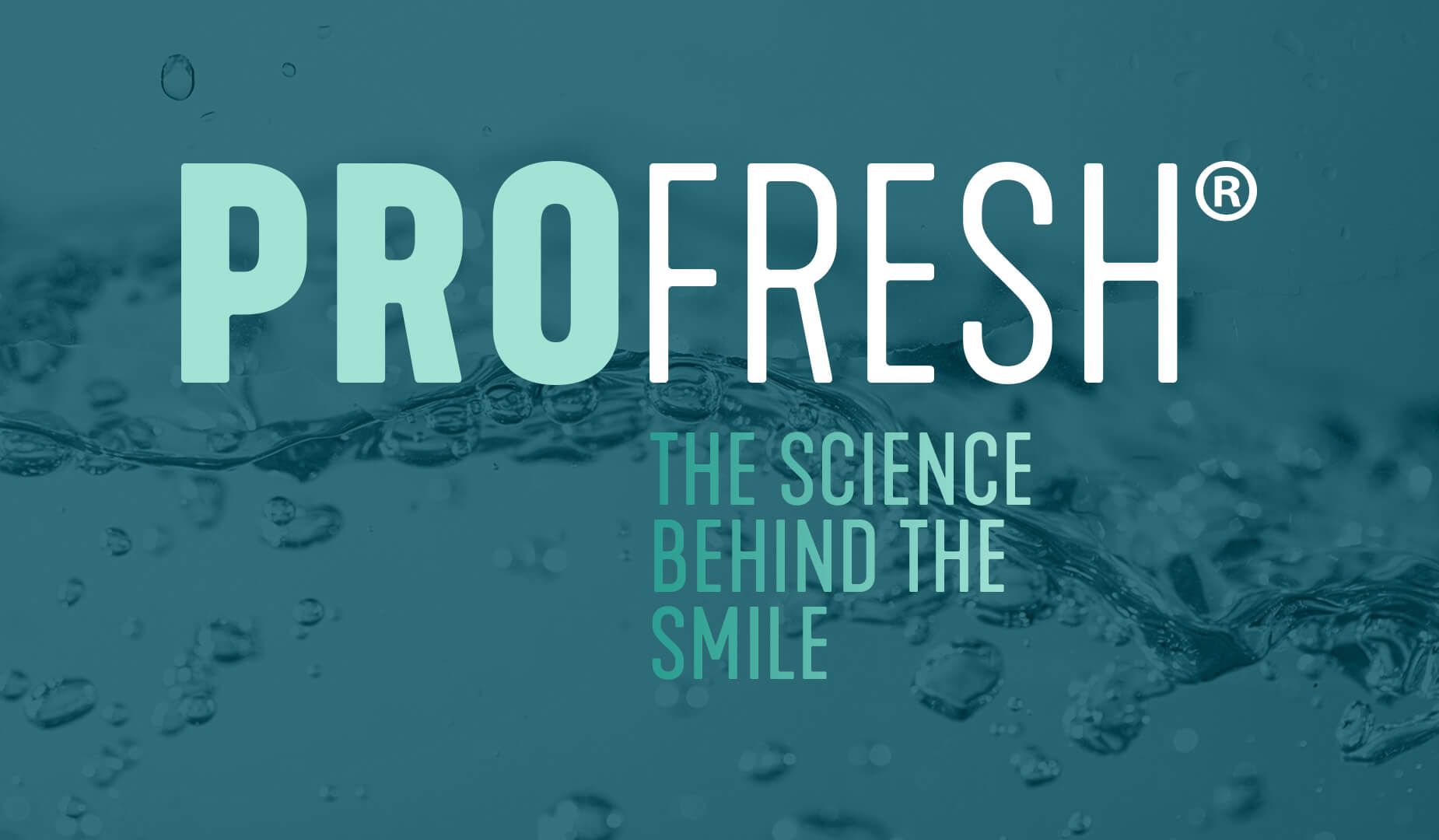
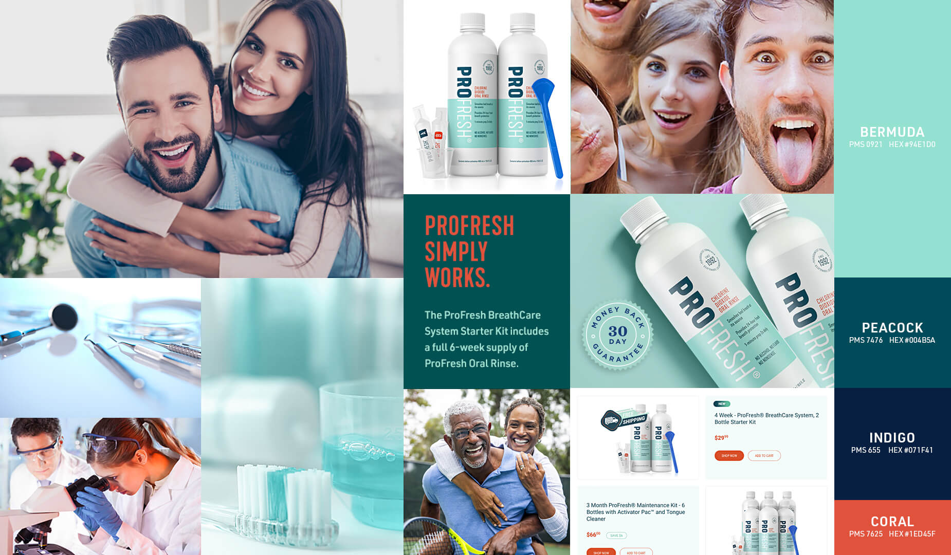
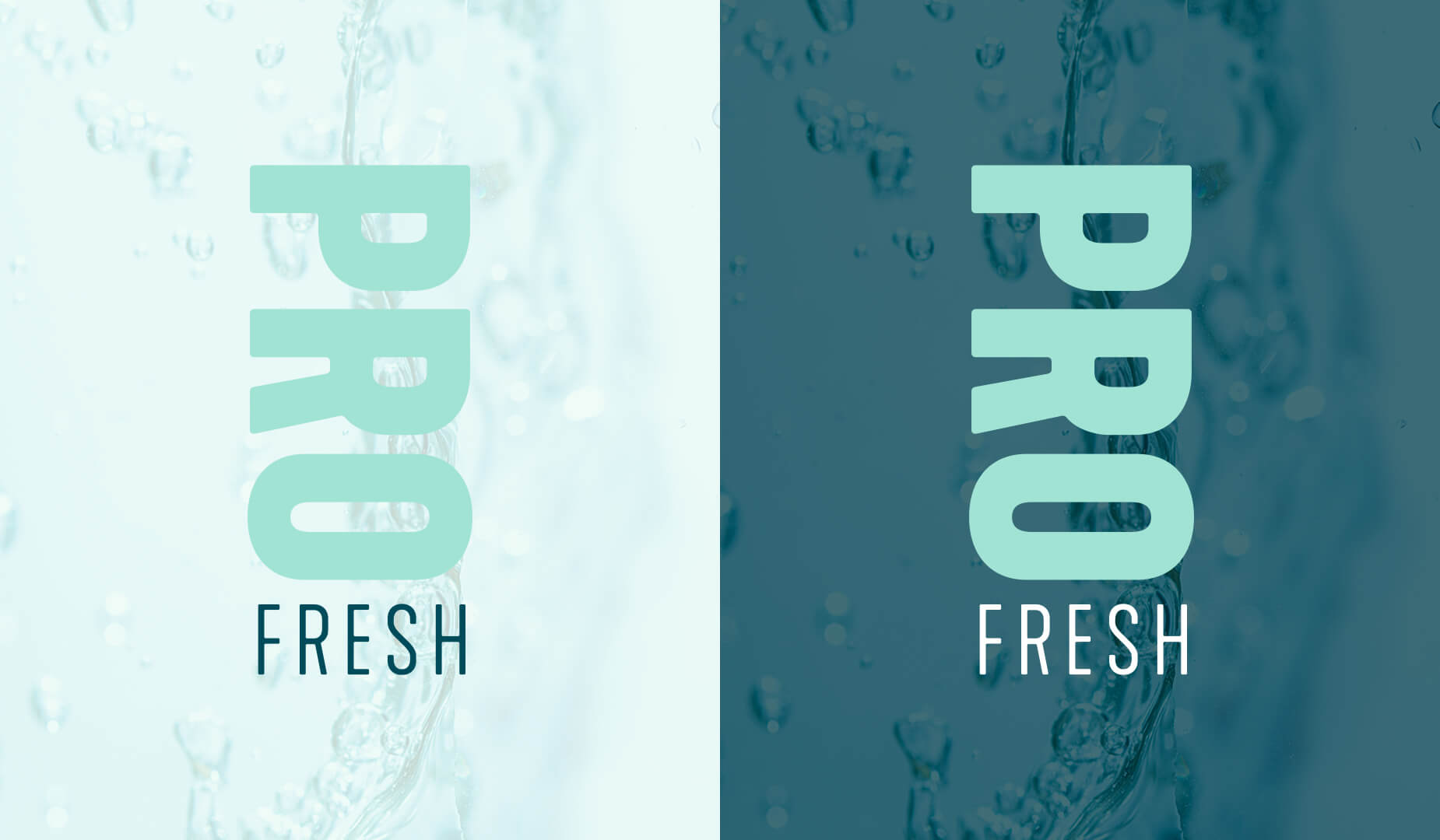
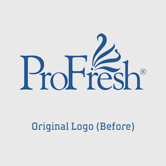
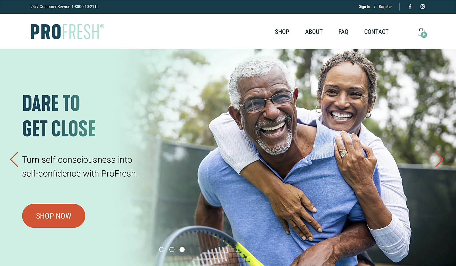
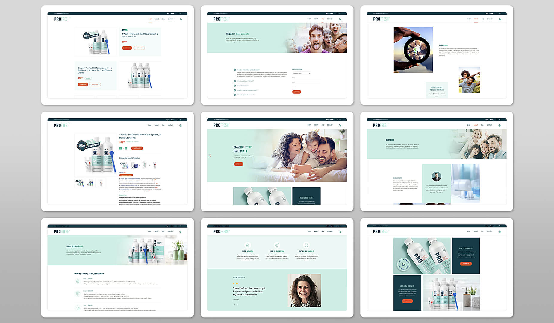
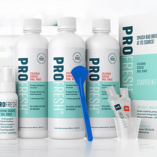
ProFresh

REPOSITIONING AN E-COMMERCE BRAND TO BETTER DEFINE ITS TARGET, MESSAGING AND OVERALL LOOK AND FEEL

OVERVIEW

Thirty years ago, Dr. Jon Richter, a dentist and founder of the Richter Center for the Treatment of Breath Disorders, developed the ProFresh BreathCare System. Millions of satisfied customers (over 7.1 million plus bottles sold) rely on ProFresh every day to help smash their chronic bad breath. Even though its core proposition is to provide fresh breath 24/7, the ProFresh brand itself had not been refreshed since its inception in 1992.

CLIENT
ProFresh
SERVICES
Consumer Research, Brand Strategy, Mood Boards, Copywriting, Tagline, Logo Identity, Look & Feel, Iconography, Print Collateral, Brand Style Guide, Website Design & Development, Social Media Cards, Customer Journey Mapping, Transactional Emails, Packaging, 2D/3D Renderings, Customer Experience
PARTNERS
Luminations Group
Medio Agency
OS3D Inc.

ENGAGE

A robust Discovery process, including consumer research, provided our team with the insights needed to help reposition and refresh the ProFresh brand. With research indicating that chronic bad breath is a physical and emotional challenge for millennials and boomers alike, it was clear that the brand needed to strengthen its positioning and messaging and refresh its overall appearance to increase engagement and provide its broad target audience with a better brand experience. The challenge: ProFresh is an e-commerce brand strictly sold online. We analyzed the customer journey across all key touch points – email, social media, website, fulfillment, shipping, packaging, and collateral - and improved the customer experience every step of the way.

EXCITE

The refreshed brand presents an entirely new personality to its target audience. A personality that is bolder and more expressive. All aspects of the new look and feel- its colors, typography, and imagery - was created to balance the product’s functional (professional) with its emotional benefits (confident, self-assured, fresh). The new sans-serif logo emphasizes the brand's professional and science-based positioning. A dark green color (peacock) gives primary emphasis to PRO or the professional side of the brand, which is then balanced by a mint green color which communicates the product's end benefit- Fresh breath. A seal was also created to reinforce the brand’s professional heritage. Coral and indigo secondary colors are used to accent key communication points throughout all applications.

INSPIRE

Chronic bad breath can be emotionally crippling causing many sufferers to avoid social interaction. Ultimately, the goal of the refresh was to create a brand that exudes confidence, conveys empathy, and attracts the attention of our target audience. We wanted to create a brand experience across all touch points that would validate current users brand choice and inspire new users to enter the franchise.

“This is the first time in the 30-plus years of our brand’s existence that we have ever embarked on a marketing initiative of this magnitude. Xhilarate and its team of strategists, designers, developers, and copywriters provided the expertise, knowledge, and guidance we needed to feel confident that we were heading in the right direction.”
RON RICHTER / CHIEF EXECUTIVE OFFICER - PROFRESH, INC.

LET’S START A PROJECT

Have a project or a napkin sketch idea? We'd love to talk with you and see if we're a good fit. Let's build something great together!