How To Spot Bad Graphic Design
Graphic design — beautiful and mighty. How to be the best at it? Let us find out together!
Graphic design has always been popular and, as a consequence of that, more and more underqualified or simply not talented enough designers have started to work with prominent companies. As the basic rule of the economy says, demand creates supply. The problem with that is the essence of design — truly astonishing things take a lot of time, knowledge, and dedication in this field. Unfortunately, an increasing number of designers skip the hard-working part, and the outcome is usually awful.
Graphic design is not just about the visual part. It’s about the connection between the product and the customer. This connection must be constructed in order to sell as many products as possible or raise the popularity of a service. Hence, a bad designer is not just the person who doesn’t know how to draw correctly or the basic color combinations; a bad designer is a person who doesn’t know how to express the purpose of the product through its design.
I will analyze the essence of a bad designer and outline the most common mistakes that should be totally avoided when creating your own. Enjoy!
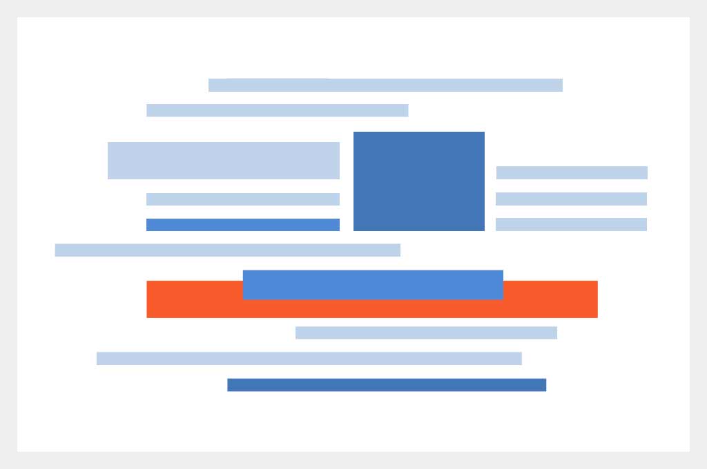
Placement
The biggest mistake that can ruin your whole concept is placing text and images together. It is not visually pleasing for customers to read a word with half a letter because you added a bigger picture. In order to avoid those kinds of problems, it’s crucial to always think about the final product and not just about the aesthetic aspects of every part. Bear in mind that the font, images, and text should look perfect in a whole composition, not by themselves.

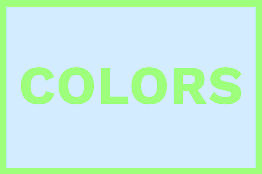
Colors
When we are talking about colors, their combinations are of paramount importance for the whole project, so you must remember that some colors simply don’t go well together. However, just a little understanding of the appropriate combinations can get you through that without problems.
The tricky part here is choosing the suitable colors for a particular product. Using basic psychological research and relevant knowledge of color trends, you can understand each color’s impact on the human brain and, based on that information, choose the used spectrum accordingly.
User Experience
All of us have seen those compositions that look gorgeous, but it takes a lot of time and nerves to understand the meaning of some letters and symbols, haven’t we? That’s another thing you ought to avoid, especially in this field. Graphic design is regularly made for the customer to comprehend the purpose of the product easier.
When designing, you should not think about the beauty of your arrangement in the first place. You should observe your design from your customer’s perspective and understand if your creation makes things simpler for him. Of course, you cannot always appreciate your own designs objectively. Therefore, it is a great idea to ask for advice and receive as many reviews as possible from people who understand the subtleties of graphic design.
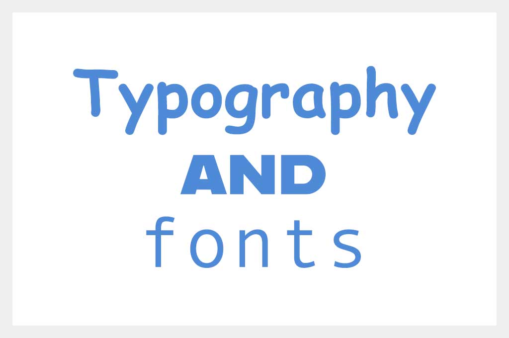
Typography and Fonts
The basic knowledge of typography is a must-have for every designer. Of course, there wouldn’t have been as many typography books and articles if this topic could’ve been covered in two or three paragraphs. It is a vast theme that takes time to learn, and the consequences of neglecting it can be outrageous.
Nevertheless, some basic things can be covered here. Their usage will add a bit of style to your composition. Another element that will ramp up the quality of your design is choosing the right font according to the rest of the composition.
It’s not good if you use too many fonts, either. Suppose a designer uses more than three or four fonts for the body text, headings, titles, logo, and some paragraphs that need to be emphasized. The text will look messy and hard to comprehend for most users.
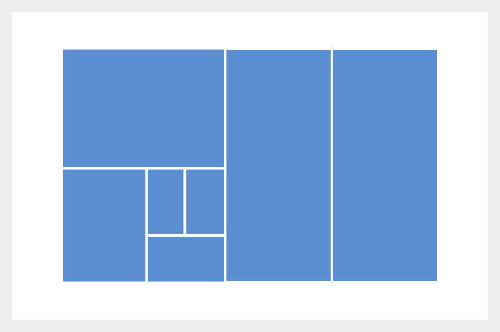
White Space
It’s crucial to keep as much white space as possible in your design because the readability will increase significantly, and the users’ experience will peak. It makes your design look more elegant and stylish. Hence, the chances that your creation becomes successful increase.
Bad designers don’t know how to keep the content and the white space well balanced, and we often see how crowded or, on the contrary, empty some websites are. The key to readable and pleasant content is balancing actual letters and white space.
How to Spot a Bad Designer?
Any hiring manager has some tricks that determine a good or bad candidate for specific jobs. If talking about getting hired, there are some stratagems that, if utilized correctly, can be very useful. These important elements make a difference between good and bad candidates, so try and optimize your application using these pro tips.

About Xhilarate
Xhilarate is a design and branding agency in Philadelphia that creates visual brand experiences that engage people, excite the senses and inspire our inner awesome. We are the arsenal of innovation. Xhilarate is a design consultancy dedicated to creating innovative brand and interactive experiences with an unyielding passion to create the extraordinary.
For More Information
Russ Napolitano / East Coast
russ@xhilarate.com
215 983 9990