3 Essential Design Trends
There’s a lot of experimentation happening in website design right now. Of course, there are micro trends everywhere, but these three elements seem to be holding steady and gaining more traction than most.
1. Down Scroll Arrows
A functional user interface element is beginning to get more design attention; scroll-down arrows are an excellent tool for long-scrolling sites or those that have full-screen images or videos.
This tiny cue tells users to keep going through the design. It’s a strong interactive cue that signals what you should do next.
What’s great here is that teams are starting to design this tiny arrow so that it matches the style and personality of the rest of the site. (There are many of these out there that look and feel like afterthoughts.)
Here’s how each of these three example sites are doing it:
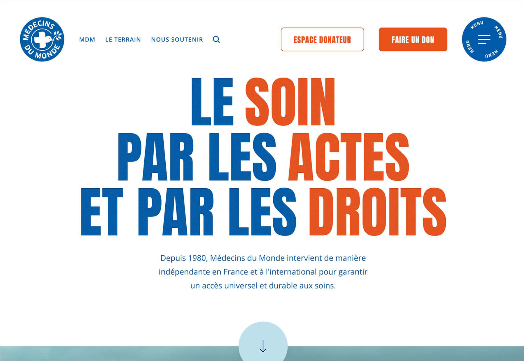
Médecins Du Monde uses a traditional down arrow at the bottom of the homepage hero area. It’s easy to see with a circular button and a standard arrow within. This is an expected treatment and is easy to implement. They do it well because of a change in color from the rest of the design and adequate sizing so that it is easy to see and interact with.
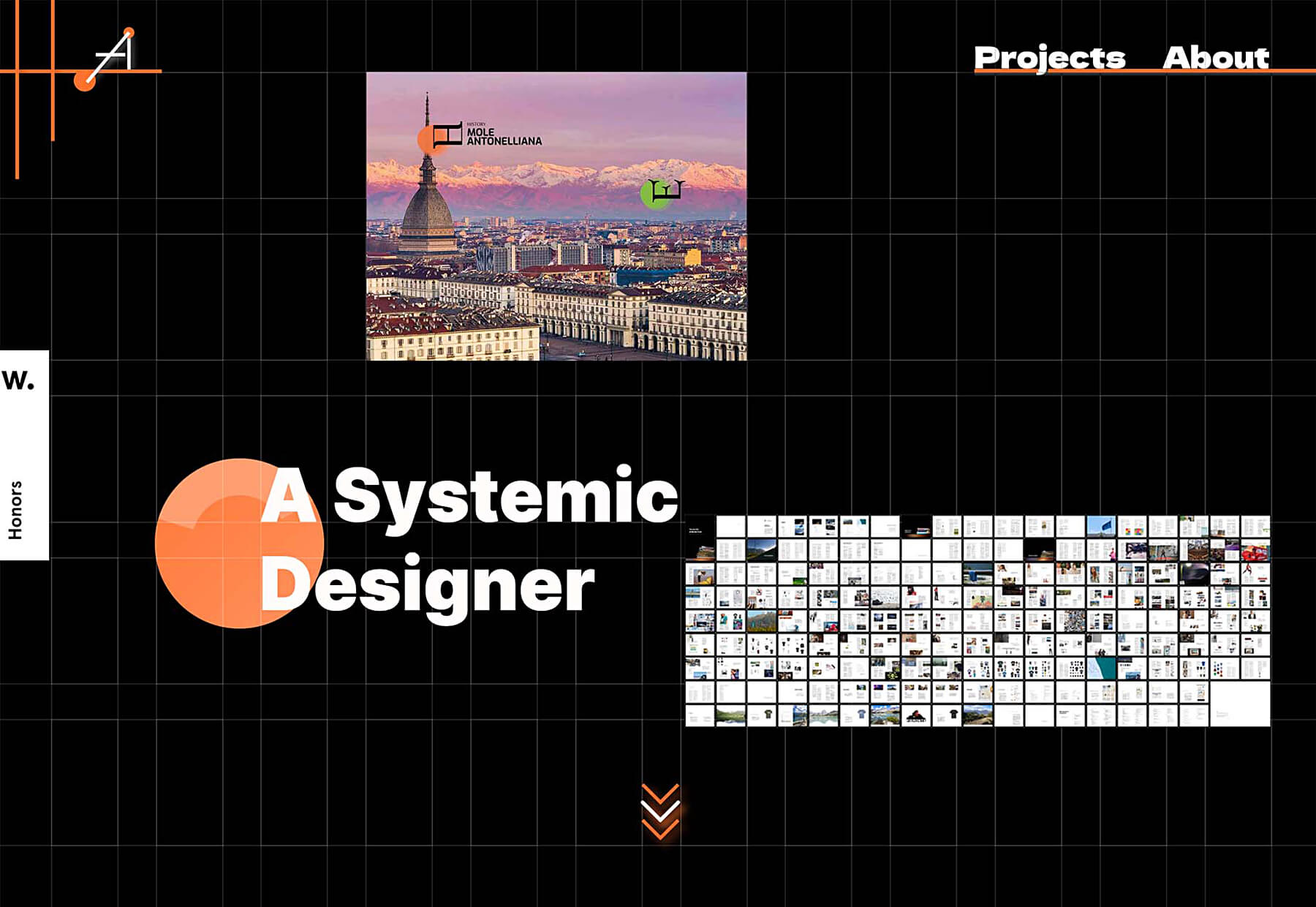
The portfolio of A Andrea stylizes the down arrow a bit more with a triple-down design. It also includes motion and a color change effect to ensure that you don’t miss the fact that you are supposed to scroll on this site.
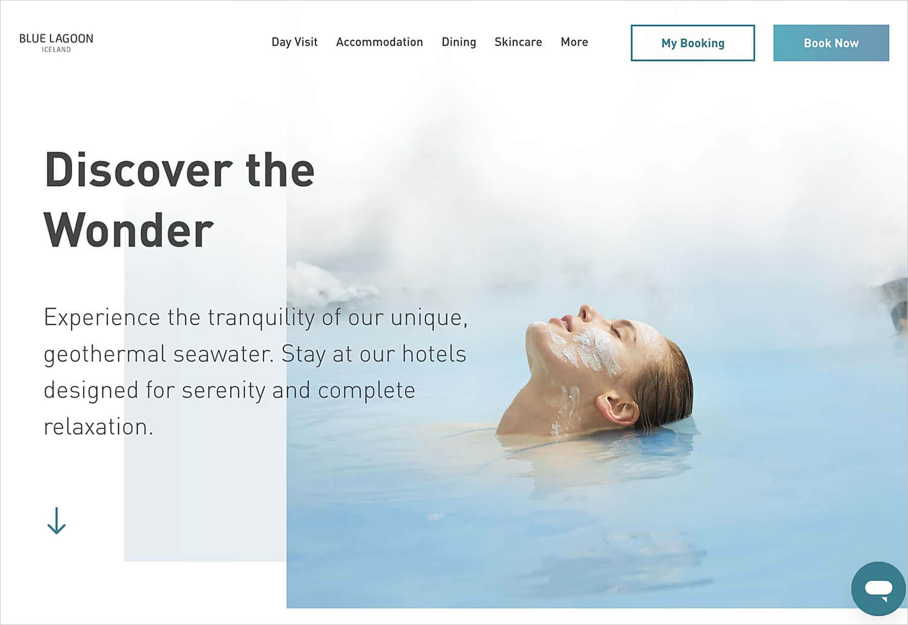
Blue Lagoon moves the scroll arrow out of the center screen and stacks it with readable content on the left side of the screen. This nontraditional placement grabs your attention because it is different, and is effective because it works with the copy above.
2. Video Options
This trend should continue to grow because it makes video more interactive, more usable, and an overall better web experience.
Designers offer video options for users that aren’t just full-screen, hero-sized, auto-loop options. They are incorporating video in more ways, at smaller scales, that put the user in control of how they interact with this content.
And it is fantastic.
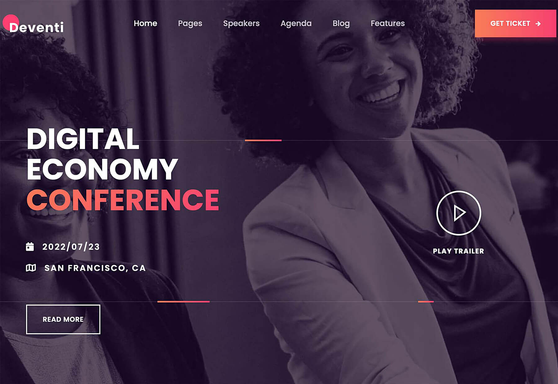
Deventi takes the most traditional approach with a full-screen image that includes a click-to-play button. What makes it nice is the hero has an engaging image and motion without the video. Click play, and you get a video that pops up in an overlay to watch.
Day by Day Digital uses a video on the homepage that doesn’t take up the whole screen and feels a lot like interacting with YouTube. The person in the video is talking to you in a dynamic way. The video is small, so you see other content and information and get a good idea of what the website design is about.
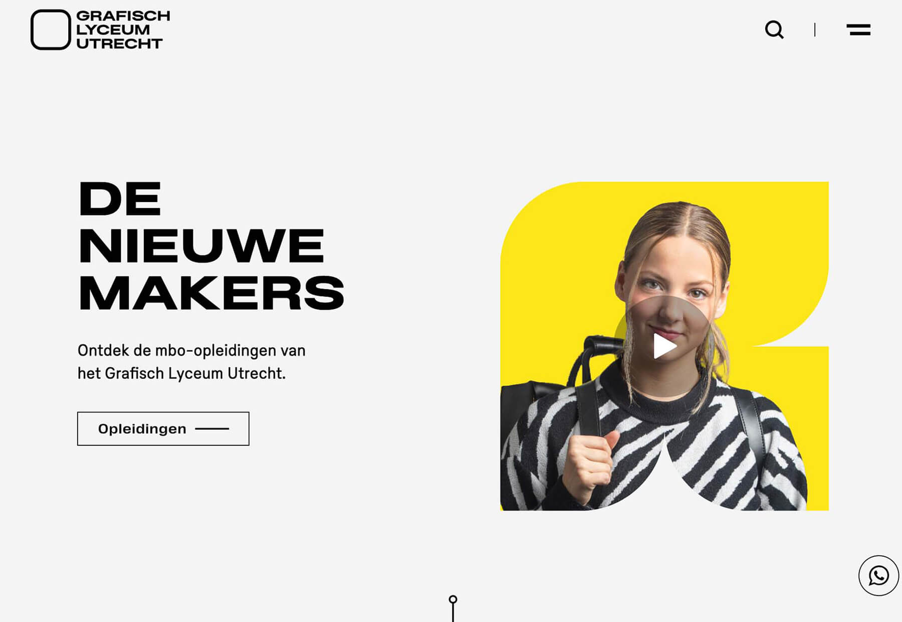
Grafisch Lyceum Utrecht places a video on the homepage in an unusually-shaped frame that takes up less than half of the screen. The user has to click to play, and upon doing so, the video expands to a full-screen, more immersive experience. What’s different is that there is always a way out (X); the user can opt in or out of audio and can even rescale the video down to an inset version.
Users’ control over video is becoming increasingly important, and the options shown in this design trend highlight this importance. It’s essential to consider your user base and their desire for this type of control in the design process.
3. Rainbow Color
Pride Month may have ended, but the rainbow theme is carrying on.
Rainbow colorways, imagery, and palettes can emit strong emotional feelings, including happiness and joy. Just think of all the times you spent marveling over rainbows as a child.
This design trend is nice because every design using it is a bit different but has a similar emotion attached to it – and there’s nothing like a little love and joy to make the world a better place.
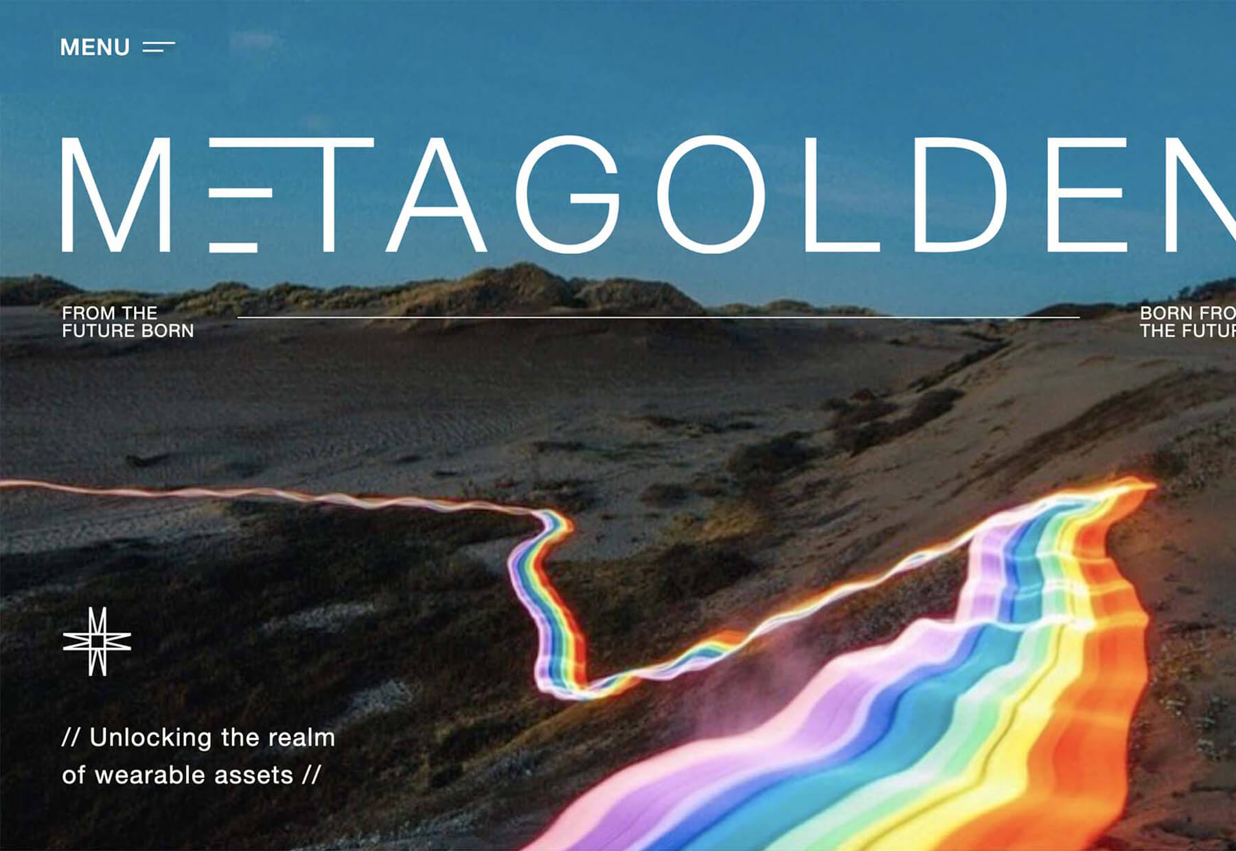
Meta Golden uses the homepage’s strongest, most obvious rainbow association with a rainbow river super-imposed in the landscape. It’s bright and fun and adds an extra emotional level to the image that might otherwise not have much impact.
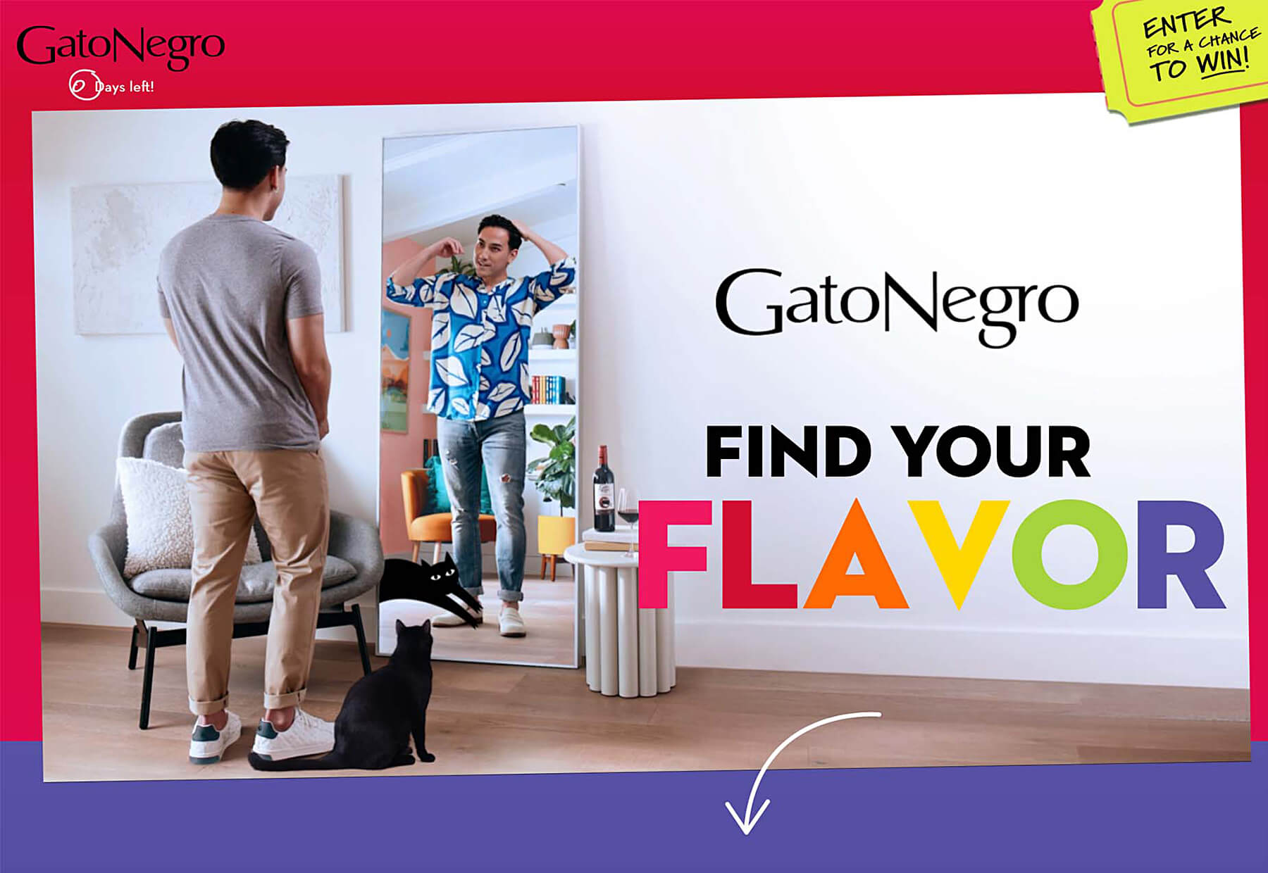
Gato Negro uses a rainbow colorway for “FLAVOR” to actually speak to those pride associations. But the effect here is nice because the word is different than pride, and while the intent is explained, it leaves some room for user interpretation because it drops below the scroll.
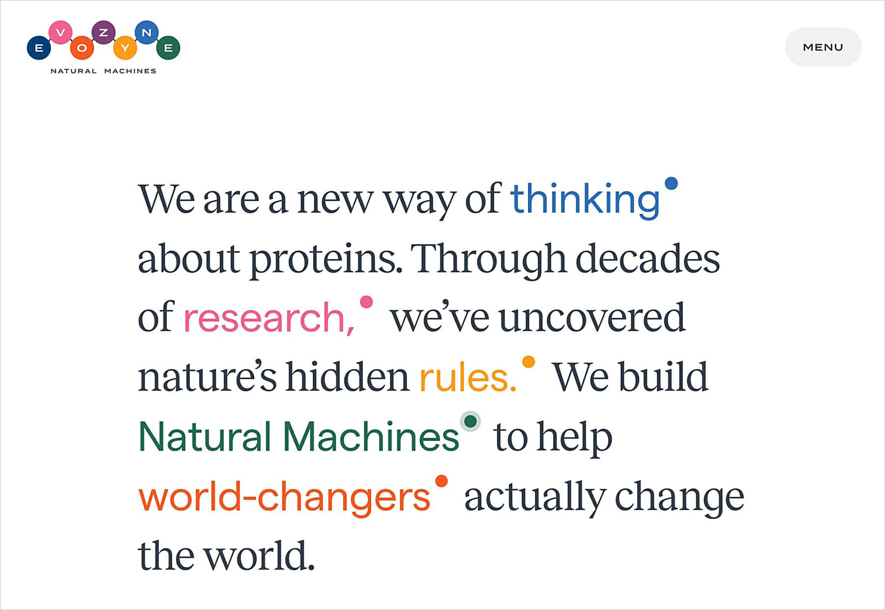
Evozyne takes another approach completely, with the rainbow color option appearing as color words in a fairly weighty text block and design. (The rainbow is further emphasized in the logo.) What’s also nice here is that the traditional rainbow colors are slightly desaturated for a more sophisticated take on the rainbow. For an extra rainbow element, click the menu for an animated geo-shaped rainbow color background that will surely hold your attention.
Conclusion
The website design trends with the most staying power are easy to implement and work with different styles well. Of these three trends, the one that fits that bill most easily is down-scroll arrows. The one that might be most difficult is rainbow color patterns.
What’s nice about all of these trends is that you can make them your own. There’s no set element; each is more of a design and style idea to help propel projects forward with a modern flair.

About Xhilarate
Xhilarate is a design and branding agency in Philadelphia that creates visual brand experiences that engage people, excite the senses and inspire our inner awesome. We are the arsenal of innovation. Xhilarate is a design consultancy dedicated to creating innovative brand and interactive experiences with an unyielding passion to create the extraordinary.
For More Information
Russ Napolitano / East Coast
russ@xhilarate.com
215 983 9990