2022 Logo Trend Report
The 20th Annual Logo Trend Report presented by LogoLounge is full of all the good, the badass, and the ugly.
Bill Gardner was recently asked to reflect back on the past 20 years of the LogoLounge Trend Report. How has it shaped the way I design? What has the impact been on me personally? What came to mind was a phrase I often use, but that others seldom understand: “It’s more important to know how you got there than to know where you are.”
Clearly, it IS important to know where you are. I’m not suggesting everyone wander around lost (although that’s sometimes a necessary part of the creative process). What I am saying is that two decades and 380,000 logos later, it’s still just as important as ever to do. the. work. A great logo transcends the trends. And I’m talking about the core definition, the Latin roots: trans (across) + scandere (climb).
As trends build momentum, swing from one extreme to the other, they leave a mark. A tangible foothold. A place to grab onto and navigate as you climb. And when you reach the summit, the beautiful views of a place where you’ve nailed the design, it’s breathtaking. When I look at a logo, I know when a designer came up with it because they did the research and foundation work–and when someone just copied something they thought was cool.
SO WHY EVEN GATHER ALL OF THESE LOGOS into one collective if pure imitation is something we dissuade? Because context is core to meaning. The best ideas never come “out of thin air.” It’s not possible for a thought to enter your mind without being preceded by another thought. And one before that. (Unless they’ve invented some new psychedelic I’m unaware of.)
We’ve never had so much information yet so little context. It’s not hard to jump online and summon a certain logo or a specific designer or topic you have in mind. But what you’re “fed” (that’s why they call it a feed, you know), is more than likely in a closed loop of things you’re already familiar with. And conversely, when you try to intentionally jump out of your bubble you find yourself swimming in such a random pool that you could drown just filtering it down to anything that resonates.
Reverse Stress
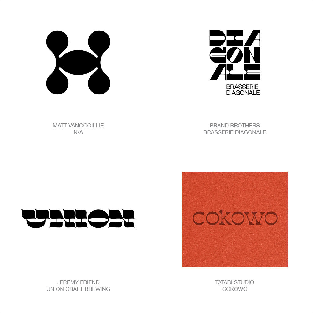
1820, and the world was awash in Didot and Bodoni style fonts with thick verticals and vapor thin horizontals.
That was the way type was meant to be! So when a craftsman at William Caslon’s type foundry created a parody font called Italian and reversed the letter stress, mayhem ensued. Brandishing fat grotesquely engorged horizontals and verticals that were thin spindly pikes, this folly was tantamount to heresy. As it began to illicit favor, enlisted as a display font on posters, other foundries followed suit with their own iterations. A notable editorial referred to these as typographic monstrosities. Spoiler alert… the monster is ALIVE and thriving in this report.
A novelty font at best but that counter distribution of weight turned type into a hedonistic, anti-academic, forbidden pleasure. Don’t look away! With a reinvigorated fan base, variations started to re-percolate from 60’s and 70’s archives and a newly infatuated cadre of type designers. Boiling into the visual brand arena, now it’s a challenge to cross a room without stepping on a wordmark or two with a heavy top and fat bottom. Doubtful these logos will be gracing the conservative c-suites of industry but they have a niche that assures the consumer base, this brand will be your sidekick if you’re looking for a good time.

VariRay
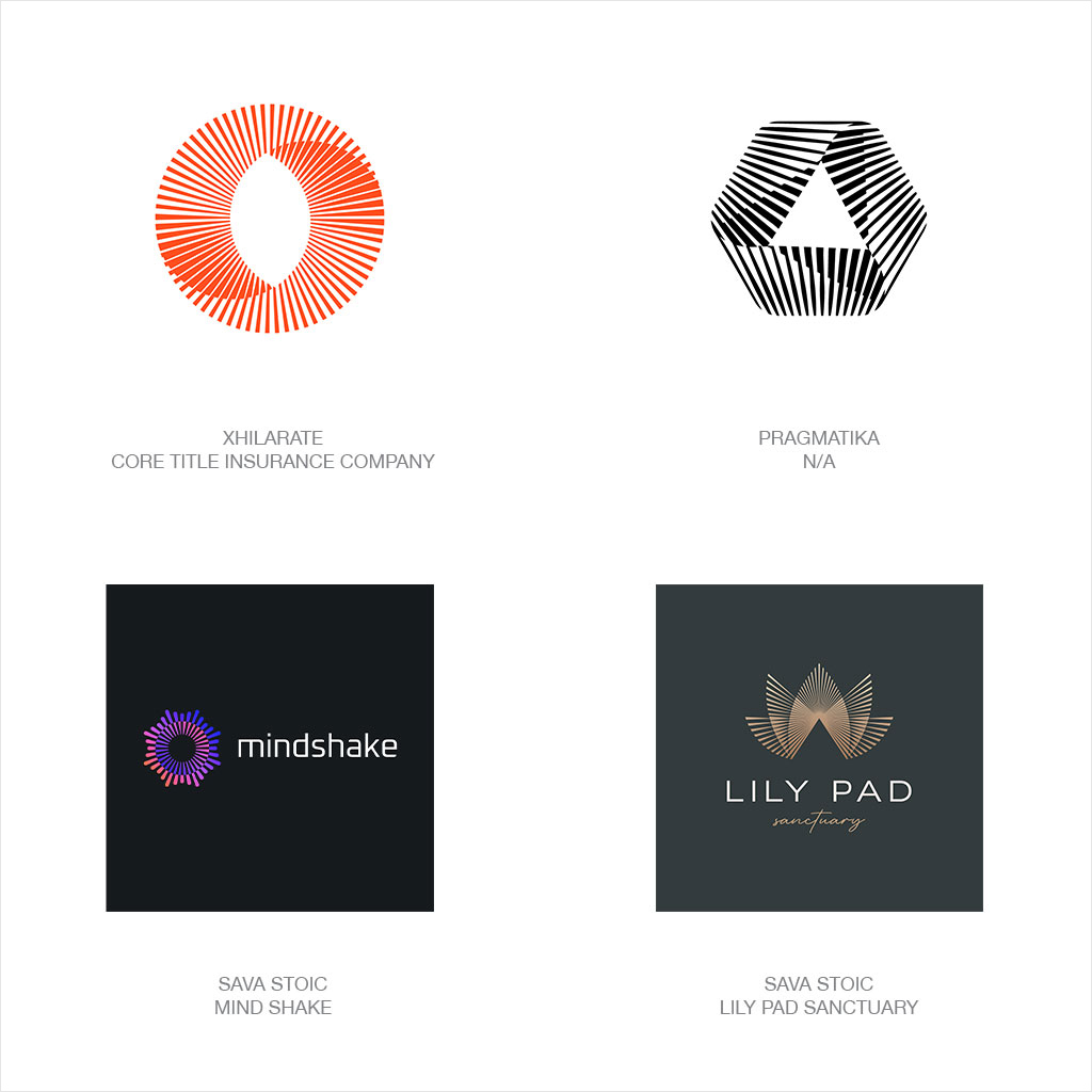
Interest in bursting ray logos which have been touched upon in prior reports continues to grow feverishly and more importantly… to evolve!
Bursts of energy and light convey an aspirational quality and are engaging and today even more dimensional than ever. Traditional circular configurations though active may pale compared to other shapes, and the technique of adding a variable step to the line weight gives these marks the illusion of layered transparency. That technique accounts for the richness and original shape in Lily Pad.
Since the composition of these radiant marks are linear, they are as much about what is there, as what is not. The nature of this ties the mark tightly to the color of the field where it lives. Often achieving the optimal glow effect forces these to live on a darker contrasting foundation. This can obviously be a limiting detractor, or an opportunity, depending on your perspective and cunning design skills. These demonstrate a shift or gain in momentum, success, speed, time, clarity, or whatever improvement the design is intended to express. Lastly, snag a peek at Pragmatika’s crystal ball as their logo smartly breaks the mold by exploring a triad of vanishing points.
Tight
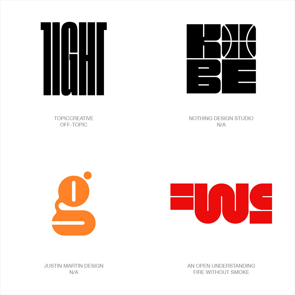
Rooting through logos at the creation of this report we spotted a veritable forest of tightly kerned, sequoia scale wordmarks crafted from fonts so tall and heavy it would have been a squeeze to fit them onto this page.
They are everywhere and you could speculate they are the antithesis of the “pay-no-attention-to-me” sans serifs so ubiquitous in our field over the last several years. That is not however the trend that made this report. The story was more about just how TIGHT those same typographic elements could actually get and it wasn’t just limited to letterforms. If these logos were air vents, we’d suffocate before wrapping this report.
Focus instead on big blocks of graphic mass with some dental floss gaps which to some might harken back to Milton Glaser’s font Baby Teeth or solid hippie poster type of that era. Many of these have a puzzle-like quality where elements are optimally packed together like a well-played game of Tetris. As novel and engaging as these are, there will be a challenge with legibility when scaling down. Though it’s the anticipated effect, reading a word crafted with this trend will take a keener eye than called for in deciphering the same effect used on a single letter monogram or symbol. This trend conveys novelty, boldness, and an excellent sense of spatial planning. Now you can breathe.
Macaroni
Allow me to start this final trend conversation with an apology to anyone who was raised in a home where macaroni broadly refers to pasta of any type, shape, or consistency.
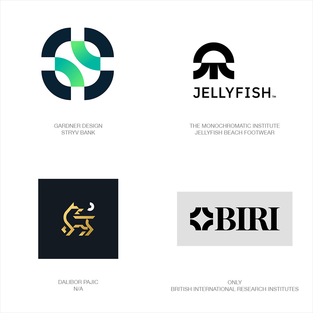
In my house it was mac and cheese and due to budget constraints, it was only on a rare occasion the name brand version graced our table. To my surprise there’s no geometric name given to this shape but whether in a half or quarter circle configuration the survey this year churned up enough Macaroni based logos to feed a small nation. Yes, this is the second shape of the year as referenced under the Almond trend.
Designers had considered this trend from some fairly unique perspectives that highlighted it dimensionally, tubular, squared and extruded, folded, cast in gradients but seldom with marinara. And as building blocks, these macaroni proved both expected and surprising. This same shape conveys a corporate message and aesthetic as well as playful when called upon. The flexibility of this component is on full display and speaks to steps on a symbolic pathway, flow and process, simplicity, and clarification as well as a no-nonsense familiarity from its simple geometry. I had to ask myself how many of these designers had their moment of creative clarity while helping their children with a pasta craft art project.
About Xhilarate
Xhilarate is a design and branding agency in Philadelphia that creates visual brand experiences that engage people, excite the senses and inspire our inner awesome. We are the arsenal of innovation. Xhilarate is a design consultancy dedicated to creating innovative brand and interactive experiences with an unyielding passion to create the extraordinary.
For More Information
Russ Napolitano / East Coast
russ@xhilarate.com
215 983 9990


